
Moron's Guide to Digital Compositing
Using Photoshop Elements
If I can do it, anyone can do it. At first I tried to keep this page vague in the details, so that people who used different software weren't left out in the cold, but I've found that by being vague I've left *everyone* out in the cold. So... I'm putting the details back in. If you have suggestions about how to improve the clarity of my explanations then please pass it on.
Let's look at two images:
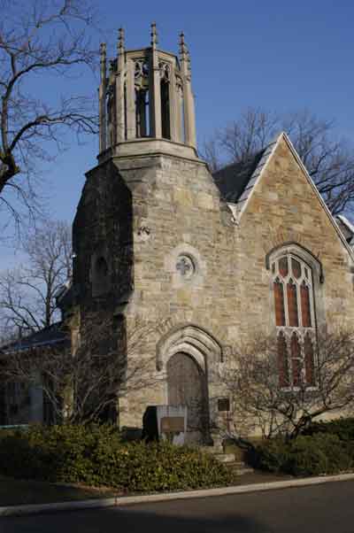
At the left is the office in a cemetery in Hamilton, Ontario. No doubt it was originally a church. It looks funky and ancient with its gothic tracery and gothic arches, so we'll use it as a base to add something into it. That something is *me*.
On the right we see an oddly-exposed picture of me wearing my big black hooded terry-cloth bathrobe. Doesn't look *too* monastic yet, but once I peel myself out of that image and stick it in front of that church, we just may have something. Note that I had pinned a white background to the wall to make it easier to separate myself from the background later on.
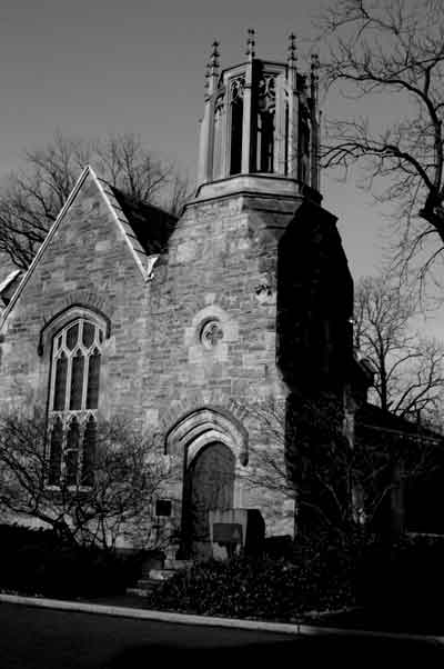
First I de-saturate the image of of the church to turn it into a black and white image using [Enhance | Adjust Colour | Remove Colour]. Once I have the colour removed I then open [Enhance | Adjust Brightness/Contrast | Brightness/Contrast] and increase contrast by a few points and drop brightness by a few points. This makes the image a bit more stark without making it overly bright. I also flipped it horizontally with [Image | Rotate | Flip Horizontal] because I'm going to want my image in the lower left corner, and I want the tower of the church to be on the opposite side for balance. That's it for the background. I considered replacing the sky with something angry-looking, but those trees would be a real pain to work around, so I'd have to replace them... in the end I just left the sky as it was.
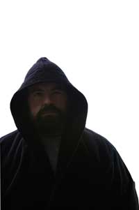

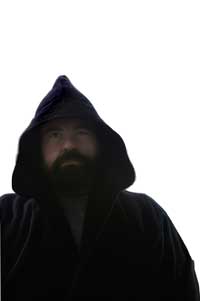
The image of me was effortlessly removed from the background using the magic wand tool. The reason it was effortless was because there is so much contrast between the background and my image, and the background colour doesn't appear in the image being removed. I simply pressed "W" to select the magic wand tool (I could have easily clicked on the magic wand icon in the toolbox, instead). I checked the tolerance in the box on the options line to make sure it was reasonable, though almost any number is reasonable for this application). One click on the background selected all of it. Now that the background was selected I was half of the way there... I wanted to make some changes to the image of me, but first I want to get rid of the background, so while the background is selected I just hit the delete key and the background disappears. Now I actually want the image of me to be selected instead of the background, and this is easily remedied by inverting the selection with [Select | Inverse]. Now I have the image of me selected, and it looked like the leftmost image above. I didn't think it really looked monastic enough, so I first used the liquefy filter [Filter | Distort | Liquify] to change the shape of the hood a bit. The liquify filter is very powerful, and a whole lot of fun to play with. I advise those who are unfamiliar with it to load up an image and play around with it in Liquify. The tool that I used to modify the hood was the Warp tool. After exiting the liquify filter I used the dodge and burn tools (you'll find them in the toolbar) to selectively lighten (dodge) and darken (burn) different areas. I dodged my face to make it lighter and more visible, and burned the top of the hood to further hide the triple-row of stitching on the edge of the hood, which is ever-so-fashionable for terrycloth bathrobes, but maybe not so spectacular on a monk's hood. With that done, I'm ready to paste my image into the background image. First I select my image again with [Select | Reselect]. Once my image is selected I feather the selection by 2 pixels. Why feather? If you paste one image into another without feathering then it's liable to be too stark a separation, and it's liable to look fake. By feathering the selection the edges of the selection are blurred a bit and it blends in far, far better. Oh, I'll need to de-saturate that image, too, to make it black and white. It *can* be snazzy to add colour elements into a black and white background, but that's not the effect I'm after right now. So I use [Enhance | Adjust Colour | Remove Colour] to turn my image to black and white, and then I select the Move tool from the toolbar. Now I can drag my image from the old picture right into the picture of the church, where it will be given its own layer. The Move tool can be used to fine-tune the placement of the added image into the background image.
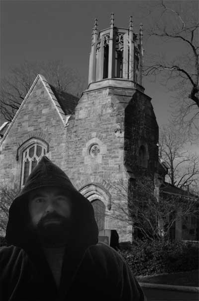 And
here's the final image. It took me far longer to make this page to try to
explain the steps than it took to actually make the image. If I was
really trying to make it look more historical then I would have cloned out the
curb, gotten rid of a couple of other small modern elements in the shot, like
that piece of roof flashing, and some eavestroughing, and then added water
spots, scratches, maybe a sepia cast... that kind of thing.
And
here's the final image. It took me far longer to make this page to try to
explain the steps than it took to actually make the image. If I was
really trying to make it look more historical then I would have cloned out the
curb, gotten rid of a couple of other small modern elements in the shot, like
that piece of roof flashing, and some eavestroughing, and then added water
spots, scratches, maybe a sepia cast... that kind of thing.